
How does it work?
Pushchair wrestling and User Experience :-)

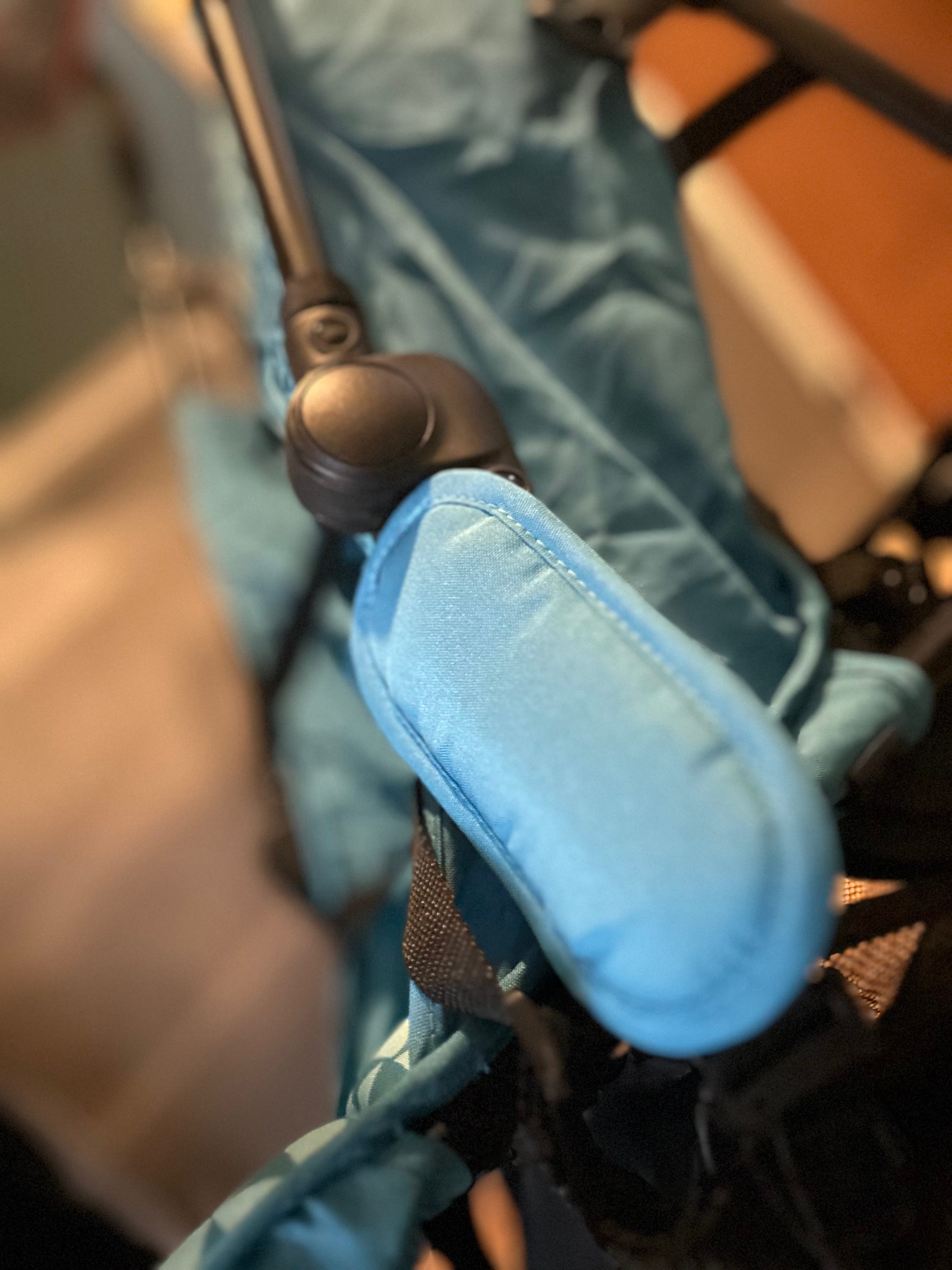
In a humbling moment, I’m battling with a pushchair in the car park of a garden centre. This is not my main pram but the backup pushchair I thought it wise to acquire but barely used, and until recently it was folded up in storage. My son suddenly seems to prefer it! So I’ve thrown the pushchair into the car boot still folded, but now I need it to unfold quickly.
It’s a freezing cold day. Of course.
A woman and her daughter walk past me as I wrestle with the pushchair’s very effective locking system. She pauses, then calls out ‘are you ok there?’ ‘Um..’ I say, mid-battle with random levers and legs, ‘no, not really!’ ‘Can we help?’ ‘Yes please!’ And so they both help me push/pull the levers before the daughter notices a subtle clip that is holding the whole pushchair together. I thank her profusely and can finally get my son into motion.
Finding it hard to work stuff sometimes is one of the reasons I was so pleased to find out about the field of User Experience (UX). The study and practical field of how to make products usable and accessible. It is underpinned by the idea that humans use products and so the way our minds work, plus our situations and contexts, need to be key factors in product design. For example - a huge part of looking after young children seems to involve adjusting straps! Straps are on prams and pushchairs, high chairs, car seats etc. Somehow my brain still gets befuddled by how to loosen or tighten these straps. It doesn’t help that the context of use nearly always involves a crying baby or increasingly wayward toddler who wants to run off! Anything with diagrams, arrows, and obvious labelling gets my vote.
I’m recognising old-school UX issues lately, the kind that have been around for a while but still cause minor challenges or vague amusement as you go about your day. When completing forms, there is often drop-down category for titles (Mr, Mrs etc.) Some of these lists are long and default to alphabetical order, so the first option is Baron or Baroness. It won’t stop users completing the form but I’m guessing there are few of us in that category! As a simple improvement, why not reduce options or show the most frequently used ones first?
How to contact an organisation should be clear and transparent. Phone lines are difficult to find for many services these days but still important for many types of user and scenario. Contact forms are now the default. Best practice is to explain the different ways questions can be asked and likely response times. During the recent snowy weather, I was trying to find out if regular toddler classes at a sports centre were still scheduled that morning. Phoning would seem the logical option (they are either there or have left on a voicemail) but this didn’t yield a response. An email did. As a user/parent, I could do without the extra work and guessing!
Cancelling a subscription is an action that can be tricky to do on some apps. Whilst signing up is usually easy, managing accounts and changing payment options is often trickier and can require logging in via a browser. It’s difficult to keep track of all subscriptions for the average human, but there are also scenarios that make it even more complex. TV apps often now have separate user accounts for different viewers. And there are so many TV apps! Related - can anyone help me to cancel Disney+ please?
Car parking is another area where UX could add value to make it a smoother task. There seems to no default experience now - some places have spaces for parents with slightly wider spots so you can open the door and lift the child out (not the easiest thing as I mentioned, with all the straps!) But many places don’t have these spaces or any way to tell if there are any free ones. Some car parks use machines for payments but increasingly it might be an app. And charges of course vary according to time of day and weekday. It’s a lot to process!
All of which provides me with continued motivation to improve things for future users.
Because if you constantly find yourself asking ‘how does it work?’, that’s an opportunity for improvement.